
To create an airy and open feel, use white space thoughtfully as a design element. It guides your viewers’ attention, making your content clear and easy to navigate. Proper white space reduces clutter, emphasizes key features, and fosters a sense of calm and sophistication. By strategically incorporating it, you guarantee your design feels balanced and inviting. Keep exploring how white space can elevate your visuals and engagement to open even more design potential.
Key Takeaways
- White space creates an airy, open feeling by reducing clutter and allowing content to breathe.
- Strategic white space guides the viewer’s eye naturally across the design.
- Using ample white space emphasizes key elements and improves overall readability.
- White space evokes sophistication and a calm, inviting atmosphere in design.
- Properly balanced white space enhances visual harmony and user engagement.
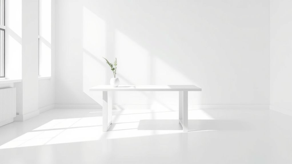
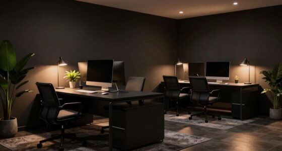
White space, often overlooked as a mere background element, actually plays a essential role in effective design. It’s not just empty space; it’s a strategic tool that influences how users perceive and interact with your content. When you utilize white space thoughtfully, it enhances visual balance, making your design feel organized and harmonious. This balance is crucial because it guides the viewer’s eye naturally across the page, preventing clutter and overwhelming sensations. By giving elements room to breathe, you allow key messages to stand out, which keeps user focus sharp and intentional.
Incorporating white space effectively means understanding how to create a sense of order. When your design feels balanced, users don’t have to work hard to find what’s important. Instead, their attention is directed effortlessly toward the main features or calls to action. White space acts as a visual separator, defining boundaries between different sections or elements. This clarity helps users process information faster and with less confusion. As a result, your content becomes more accessible, and the overall user experience improves considerably.
Using white space also influences how users engage with your design. When you leave enough space around text, images, or buttons, it becomes easier for users to focus on each component without distraction. This clarity encourages interaction—whether it’s reading an article, clicking a link, or filling out a form. White space subtly guides users toward your intended path, making navigation intuitive and seamless. It’s a way to prioritize what matters most, drawing attention precisely where you want it, which ultimately boosts user focus and retention.
Furthermore, white space can evoke a sense of sophistication and professionalism. It lends your design an airy, uncluttered feel that communicates confidence and clarity. When you avoid cramming your layout with too many elements, you create a visual environment that feels calm and inviting. This, in turn, encourages users to spend more time engaging with your content because they’re not overwhelmed. In essence, white space isn’t just empty; it’s active, helping to shape perceptions and direct attention while maintaining visual balance.
Additionally, understanding how AI-generated music impacts creative practices can help designers craft more engaging and innovative visual narratives that resonate with modern audiences. Ultimately, mastering the use of white space transforms your design from chaotic to cohesive. It’s a powerful tool to control visual flow, improve user focus, and establish harmony. When you recognize its importance and incorporate it strategically, your designs become more effective, engaging, and memorable. White space isn’t just filler—it’s a fundamental element that elevates your entire approach to visual storytelling.

gianotter Dual Monitor Stand Riser, Desk Organizer With Drawer and 2 Pen Holders, Computer Monitor Stand, Desk Shelf for Top of Desk (Black)
【Ample Storage Space】The dual monitor stand features two magnetic pen holders and a drawer, allowing you to easily...
As an affiliate, we earn on qualifying purchases.
Frequently Asked Questions
How Does White Space Influence User Perception of a Brand?
White space influences your perception of a brand by making it seem more professional, clean, and trustworthy. When you see ample white space, you naturally associate the brand with clarity and quality, which boosts your trust. It also helps you focus on key messages without feeling overwhelmed. Overall, white space creates a positive impression, shaping your perception of the brand as modern, reliable, and user-friendly.
Can Excessive White Space Negatively Impact Website Engagement?
Excessive white space can negatively impact your website engagement by creating visual clutter and causing user distraction. When there’s too much empty space, visitors might find it hard to focus on key content or calls to action, leading them to leave sooner. Striking the right balance helps guide users naturally through your site, ensuring they stay engaged without feeling overwhelmed or lost in emptiness.
What Are Common Mistakes When Using White Space in Design?
You often make mistakes with white space when you create visual clutter or crowded layouts, which can overwhelm users. Avoid cramming elements too close together, as this reduces clarity and makes your design feel chaotic. Instead, give enough space between objects to guide the eye smoothly. Overusing white space can also make your site look empty or unbalanced, so find the right proportion to maintain harmony and readability.
How Does White Space Vary Across Different Cultural Contexts?
You’ll find white space’s impact varies across cultures because of different perceptions and design preferences. In Western contexts, white space often symbolizes clarity and sophistication, while in some Asian cultures, it may represent emptiness or loss. Recognizing these cultural perceptions helps you adapt your design to resonate better with diverse audiences. By understanding these differences, you guarantee your use of white space communicates effectively across cultural boundaries.
Are There Specific Industries That Benefit More From White Space?
You’ll find that luxury branding and tech startups benefit most from white space. Luxury brands use it to evoke elegance, sophistication, and exclusivity, making their products feel premium. Tech startups, on the other hand, use white space to create a clean, user-friendly interface that enhances usability and focus. By leveraging white space effectively, these industries can communicate clarity, confidence, and innovation, making their designs more appealing and impactful.
Taja To Do List Notepad - To Do List Notebook for Work with 52 Sheets, 9.8" x 6.5", Undated Daily Planner Perfect for Daily Tasks and Goal Setting, Notepad Suitable for Office, Home & School - Greenery Sway
Stay Organized with Ease: Our To Do List Notepad provides multiple sections with plenty of space to jot...
As an affiliate, we earn on qualifying purchases.
Conclusion
By embracing white space, you create a clean, inviting design that guides your audience effortlessly. For example, imagine a website for a boutique hotel where ample white space highlights stunning images and key information, making visitors feel relaxed and welcomed. When you use white space thoughtfully, you improve readability, focus attention, and elevate your overall aesthetic. So, don’t fear empty space — it’s a powerful tool that can transform your design and leave a lasting impression.
MDOZQ Office Desk Accessories 2pcs Computer Monitor Memo Board Message Board Supplies for Women Men Sticky Note Holder Home Desktop Decor
[MULTIFUNCTIONAL]You'll get 2 pieces computer monitor memo boards that you can stick on the left and right edges...
As an affiliate, we earn on qualifying purchases.

Set of 4 - Concrete Desk Accessories For Modern, Industrial, Minimalist Office Decor- Aesthetic Desk Organizers Accessories For Women or Men- Pen, Business Card Holder & Sticky Note, Paper Clip Holder
➤Set of 4 - Cost-effective ----- Enhance your office with quality pen holder, business card holder, sticky note...
As an affiliate, we earn on qualifying purchases.