To create a minimalist space that’s more vibrant than just white, focus on incorporating subtle color accents, contrast, and carefully chosen palettes. Using bold details like a colorful chair, vibrant pillows, or striking artwork adds personality without clutter. Balancing neutral tones with strategic pops of color creates depth and interest, making your space feel lively yet calm. If you want to discover how to master this balance effortlessly, there’s more to explore.
Key Takeaways
- Incorporate bold accent colors through furniture, art, or accessories to add vibrancy without cluttering the space.
- Use contrasting neutral tones like warm greys, beiges, and black to create depth and visual interest.
- Select a subdued color palette as a base and add small pops of bright color for focal points and personality.
- Emphasize strategic placement of colorful decor to highlight key areas and maintain minimalism’s clean aesthetic.
- Balance bold and neutral tones to evoke a lively yet serene atmosphere, avoiding dullness or overwhelming visuals.
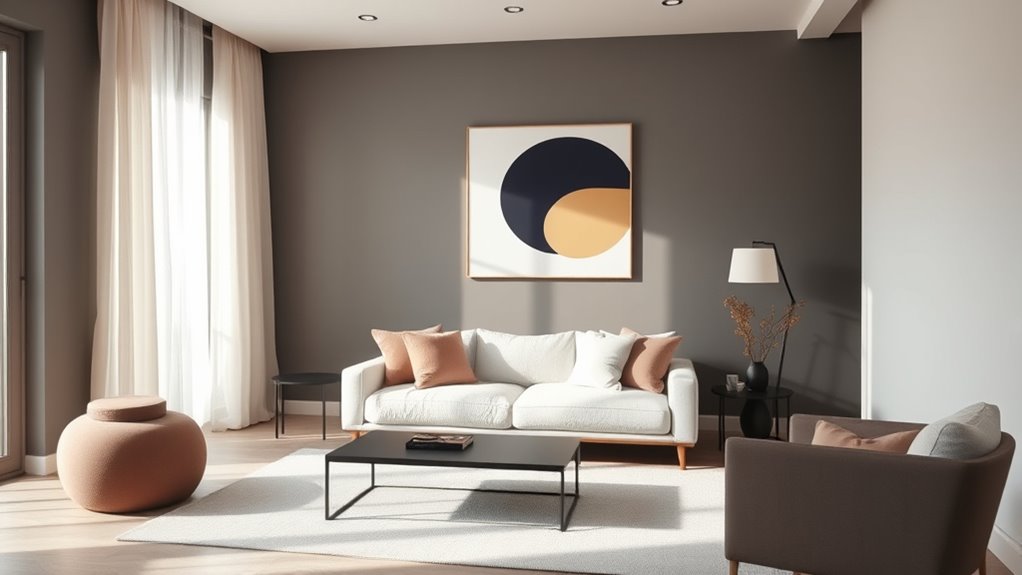
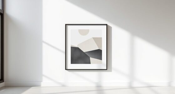
Have you ever noticed how a simple color palette can make a space feel more calming and sophisticated? When you’re aiming for a minimalist aesthetic that’s anything but boring, it’s all about choosing the right colors to keep things interesting without overwhelming the senses. Instead of sticking with plain white walls or monotone shades, consider incorporating bold color accents. These small pops of vibrant color can breathe life into an otherwise subdued space, drawing your eye and creating focal points that keep the environment engaging. Think about adding a bright red chair, a striking blue vase, or a lively yellow throw pillow. These accents don’t need to dominate the room; they just need to make a statement that complements the overall minimalist vibe.
In a minimalist space, bold color accents add vibrancy and focal points without overwhelming simplicity.
Incorporating color contrast can further enhance the depth and visual interest of your space, making it feel more dynamic and thoughtfully designed.
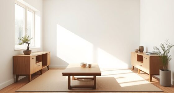
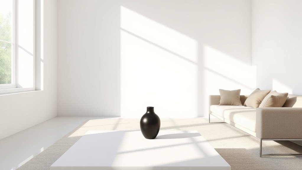
Contrasting neutral tones are your best friends when aiming for a minimalist look with depth. Rather than blending everything into a sea of sameness, you can create visual interest by pairing soft beiges or warm greys with darker shades like charcoal or black. This contrast adds dimension and sophistication without clutter. For example, a light-colored wall can serve as a backdrop for black-framed artwork or furniture, making each element stand out sharply against the neutral background. It’s about balancing simplicity with subtle drama, giving your space a polished appearance that’s both calming and stimulating.
When selecting a color scheme, think about the mood you want to evoke. Bold accents can energize a room, making it feel lively and dynamic, while contrasting neutral tones ground the space, giving it a sense of stability and serenity. Use bold colors sparingly—perhaps as a single statement wall or in small decorative pieces—so they don’t overwhelm the minimalist aesthetic. The key is restraint; let the contrasting tones and accents work together harmoniously. This approach prevents the space from feeling too stark or sterile, ensuring it remains inviting and expressive.
Incorporating these color strategies allows you to craft a minimalist space that’s both stylish and full of personality. By carefully choosing where to add bold accents and how to contrast neutral tones, you create a layered look that’s visually compelling yet uncluttered. It’s about making intentional choices that highlight your taste and personality without sacrificing the clean, simple lines that define minimalism. Ultimately, this approach proves that minimalism isn’t about boring sameness but about smart, deliberate use of color to make your space feel vibrant, balanced, and uniquely yours.

OLIXIS Comfy Accent Chair for Living Room Bedroom and Waiting Room, Upholstered Mid-Century Reading Chair with Pillow and Solid Wood Legs, Wide Singe Modern Lounge Sofa (Beige)
Timeless Midcentury Modern Style: Elevate any room with this chic lounge chair’s sleek silhouette, clean lines, and minimalist…
As an affiliate, we earn on qualifying purchases.
As an affiliate, we earn on qualifying purchases.
Frequently Asked Questions
How Can I Add Warmth to a Minimalist Color Palette?
To add warmth to your minimalist color palette, incorporate warm neutrals like beige, taupe, or soft terracotta. Use textured fabrics such as wool throws, linen cushions, or woven rugs to create visual and tactile depth. These elements bring coziness without cluttering your space. Keep your overall design simple, but let the warm neutrals and textured fabrics stand out to evoke a welcoming, inviting atmosphere.
What Are Some Unexpected Color Combinations for Minimalism?
You can create visual harmony in minimalism with unexpected color combinations like deep navy with warm terracotta or muted olive with blush pink. These pairings challenge traditional color psychology, adding interest without clutter. Keep the palette balanced to maintain simplicity, and let contrasting hues highlight key areas. This approach keeps your space fresh and engaging, proving that minimalism doesn’t have to be boring or predictable.
How Do I Choose Accent Colors Without Overwhelming the Space?
To choose accent colors without overwhelming your space, consider color psychology—pick hues that evoke the mood you want. Use accent wall ideas like a bold, yet balanced color, or subtle pops of color in accessories. Keep the main palette neutral, allowing the accent colors to stand out without cluttering the room. This approach creates visual interest while maintaining a calm, minimalist vibe.
Can Bold Colors Work in a Minimalist Design?
Bold hues can absolutely work in a minimalist design if you use them thoughtfully. You create striking color contrast by choosing one or two bold hues as accents against a neutral background. Keep the rest of the space simple, allowing the bold colors to stand out without overwhelming. This approach adds energy and personality while maintaining the clean, uncluttered feel that minimalist design aims for.
How Do I Maintain Balance With Multiple Non-White Hues?
Isn’t it tempting to think too many hues could clash? To maintain balance with multiple non-white colors, prioritize color contrast to create focal points and anchor your space. Use a dominant hue and let other colors serve as accents, ensuring visual harmony. Keep the palette cohesive by sticking to a similar tone or saturation, which helps your design feel unified rather than chaotic. This approach keeps your minimalist aesthetic fresh and engaging.

Yangest Orange Square Throw Pillow Cover Wavy Velvet Cushion Cover Modern Zippered Pillowcase for Sofa Couch Bedroom Living Room Chair, 18 x 18 Inch
Package includes: 1 throw pillow. (Please Note: PILLOW COVER ONLY, NO CUSHION INSERT)
As an affiliate, we earn on qualifying purchases.
As an affiliate, we earn on qualifying purchases.
Conclusion
By choosing a minimalist color scheme beyond just white, you create a space that’s both calming and visually interesting. Did you know that homes with a thoughtfully curated color palette tend to feel 20% more inviting? So, don’t be afraid to experiment with subtle shades and accents. With the right balance, you’ll craft a minimalist look that’s fresh, engaging, and uniquely yours—without ever feeling boring.

Framed Neutral Wall Art for Living Room, Large 3 Piece Abstract Pastel Grunge Forest Landscape Tree Canvas Artwork Set, Modern Art Decorative Nordic Painting Picture Prints for Hallway Office 24×36 In
【Framed Wall Art】Large framed pastel grunge forest tree landscape wall arts, encased in robust wood-colored frames, each measuring…
As an affiliate, we earn on qualifying purchases.
As an affiliate, we earn on qualifying purchases.

Ymapinc 5 Pcs Vintage Green Crystal Hairpin, 2 Short + 3 Long Set Hair Clip for Women, 80s 90s Style Emerald Green Decorative Pins Elegant Hairpin Accessories
Vintage Green Crystal Hairpin Set: This elegant 5-piece set features 2 short and 3 long hair clips, each…
As an affiliate, we earn on qualifying purchases.
As an affiliate, we earn on qualifying purchases.