Exploring minimalist color schemes beyond black and white opens opportunities to incorporate calming earth tones and soft pastels that enhance simplicity and evoke specific moods. Earth tones like warm beiges, muted greens, and browns create a grounded, cohesive look that works well with various textures, while pastels such as pinks, blues, and lavenders add gentle contrast and serenity. Using these palettes thoughtfully helps you achieve balanced, harmonious spaces that feel both modern and inviting; explore further to discover how to refine your own designs.
Key Takeaways
- Earth tones like browns, greens, and beiges create a grounded, warm, and versatile palette that promotes calmness and cohesion.
- Pastel colors such as soft pinks, blues, and lavenders evoke serenity and approachability, adding subtle contrast without clutter.
- Incorporating earth tones and pastels enhances visual harmony, allowing textures and forms to stand out in minimalist spaces.
- These color groups support a clean, uncluttered aesthetic while offering emotional warmth and a connection to nature.
- Thoughtful use of muted and soft hues helps maintain simplicity and focus, elevating minimalist design beyond black and white.
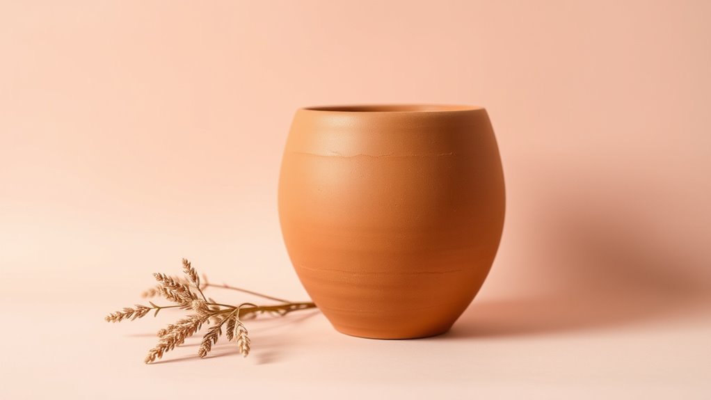
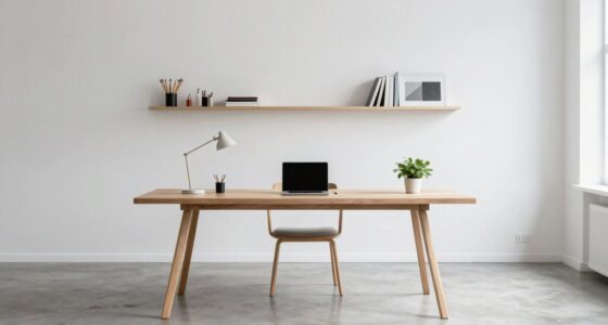
Minimalist color schemes focus on using a limited palette to create clean, cohesive, and visually calming designs. While black and white are classic choices, exploring beyond them opens up a world of subtlety and sophistication. Earth tones and pastels, in particular, offer an invigorating alternative that aligns well with minimalist principles. These color choices can evoke specific emotions and moods through the power of color psychology, subtly influencing how viewers perceive and feel within a space or design. For example, soft browns, muted greens, and warm beiges can foster feelings of stability, warmth, and connection to nature. Pastels, like gentle pinks, light blues, and pale lavenders, tend to evoke serenity, softness, and approachability. When you select these hues thoughtfully, you’re applying core design principles—balance, contrast, and harmony—to craft spaces that feel both intentional and effortless. Incorporating color harmony helps ensure that your chosen palette remains cohesive and pleasing to the eye.
In minimalist design, the strategic use of color is essential to creating visual harmony. When you choose earth tones, you’re leaning into colors that are naturally grounding and versatile. They work well with many textures and materials, reinforcing a sense of cohesion without overwhelming the senses. Pastels, on the other hand, provide a delicate contrast to more intense or darker colors, allowing you to highlight specific elements while maintaining an overall calm atmosphere. These color schemes often emphasize simplicity and clarity, ensuring that each element serves a purpose without cluttering the visual field. By limiting your palette, you make it easier to focus on the form, texture, and spatial relationships within your design, which is fundamental to minimalist aesthetics.

Framed Neutral Abstract Wall Art, Large Modern Canvas Prints Paintings Artwork for Walls, Minimalist Earth Tone Abstract Pictures for Living Room Lounge Dining Bedroom Office Wall Decor 30×30 In
[Framed Wall Art]: This large 30×30 inch framed abstract wall art features layered earth tones including beige, tan,…
As an affiliate, we earn on qualifying purchases.
As an affiliate, we earn on qualifying purchases.
Frequently Asked Questions
How Do Earth Tones Influence Mood in Minimalist Designs?
Earth tones influence your mood in minimalist designs by creating a warm, calming atmosphere. They allow for subtle color integration, making spaces feel cozy and inviting without overwhelming the senses. The emotional impact of earth tones fosters relaxation and stability, helping you feel grounded. By choosing these colors, you enhance your environment’s serenity and balance, making your space feel more natural, peaceful, and effortlessly stylish.
Can Pastel Schemes Be Used for Professional Branding?
Did you know that 78% of consumers say brand aesthetics influence their purchasing decisions? Pastel schemes can definitely be used for professional branding, creating a soft, approachable vibe. Incorporating pastel branding into your professional color palettes makes your brand feel fresh and modern without sacrificing sophistication. You just need to choose the right shades to match your industry and target audience, ensuring your branding remains polished and effective.
What Colors Pair Best With Earth Tones in Minimalism?
You should pair earthy neutrals like taupe, beige, or warm greys with soft greens, muted blues, or gentle blush tones. For effective color pairing tips, keep contrast subtle to maintain minimalism’s clean look. Light, warm shades complement earth tones beautifully while adding depth without overwhelming. Stick to natural, subdued hues to create a harmonious, calming palette that enhances your minimalist aesthetic and feels cohesive and sophisticated.
Are Pastel Colors Suitable for Outdoor Minimalist Spaces?
Pastel colors are like soft whispers in outdoor spaces, making them perfect for garden pathways and outdoor furniture choices. They add a delicate touch to your minimalist oasis without overwhelming the scenery. Using pastels, you create a serene atmosphere that complements nature’s palette. These gentle hues brighten your space, balancing earth tones and enhancing the overall calmness. Embrace pastels outdoors—they’re the breath of fresh air your minimalist garden needs.
How Do I Balance Color Contrast in Earth-Tone Minimalism?
To balance color contrast in earth-tone minimalism, you should focus on color harmony by choosing shades that complement each other naturally. Use contrast techniques like pairing lighter tones with darker ones or adding subtle accent colors to create visual interest without overwhelming the space. Keep the palette simple, and allow the textures and materials to enhance the contrast, ensuring your design remains calming and cohesive.

Mindoub 6 PCS Pastel Calm Down Corner Throw Pillowcase 18×18 Inch Square Throw Pillow Covers Reading Nursery Home Bedroom Decor Teacher Counselor(Covers Only)
ADORABLE COLOR: These solid color pillow cases are teacher and school counselor office must have and it can…
As an affiliate, we earn on qualifying purchases.
As an affiliate, we earn on qualifying purchases.
Conclusion
Imagine walking into a room painted in soothing earth tones, feeling instantly calm and centered—like a gentle breeze on a quiet morning. Just like that peaceful space, choosing minimalist color schemes beyond black and white can transform your environment into a sanctuary. Studies show that these subtle hues boost relaxation and focus. Embrace pastels and earthy shades to create a balanced, inviting space—your personal retreat where simplicity truly speaks volumes.

Therapy Office Decor Mental Health Sign Take a Deep Breath Wood Block Sign School Counselor Office Calming Corner Home Shelf Tabletop Decor 5 X 5 Inches
Dimensions: 5" x 5".
As an affiliate, we earn on qualifying purchases.
As an affiliate, we earn on qualifying purchases.

8×10 Area Rugs Living Room: Washable Large Neutral Brown Rug Abstract Soft Modern Stain Resistant Indoor Floor Non-Slip Carpet for Bedroom Nursery Kids Office Playroom Dining Room Under Table Home
Machine Washable & Effortless Cleaning: Loongrug washable rug simply toss in washing machine for a quick refresh. Its…
As an affiliate, we earn on qualifying purchases.
As an affiliate, we earn on qualifying purchases.